BET+: Defining a Premium Digital Identity

.gif)
Streaming was supposed to democratize storytelling, but the algorithms that powered discovery were trained on data that doesn't see most of America. Culturally specific content wasn't being deprioritized by people, it was being deprioritized by math. So at BET+ we helped build our own system, the Culture OS, an AI decision architecture trained on 59.8 trillion first party data points from an audience that is nearly 70% Black women. It powers recommendation engines calibrated for cultural affinity, subscriber health scoring, and content valuation tools that measure what matters to our audience instead of a general market model.


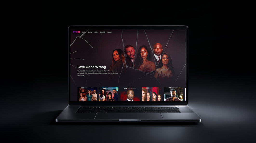
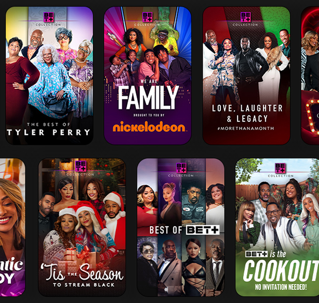
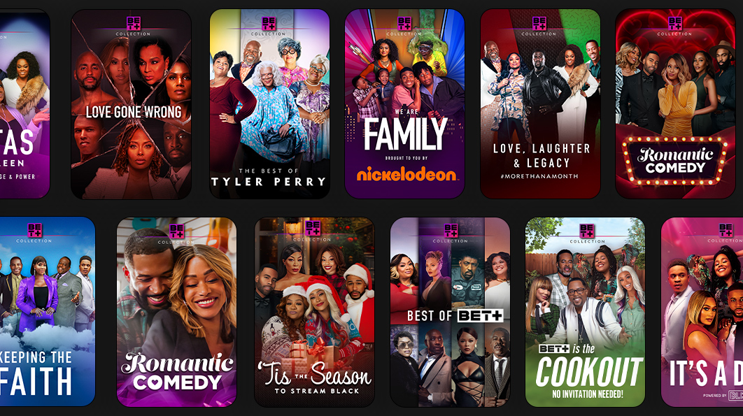
My job as a creative leader was to design on top of that system. I led the visual direction of key art for BET+ originals and major content drops, building a repeatable creative standard across typography, composition, color, and messaging, then adapting it title by title for streaming, social, and partner placements. Beyond campaigns, I shaped the platform experience through curation, designing collection systems, seasonal moments, and editorial groupings that turned browsing into storytelling. A clear example was the Love Gone Wrong collection, where we reframed existing titles through refreshed key art and prominent placement and drove a measurable wave of new sign ups, proving how packaging and positioning could create real performance even without a new premiere.
.gif)

The results made the case. 35 million unique users reached, more than 2 billion hours viewed, a 73% lift in original series viewership, conversion up 64%, churn down 40%, lifetime value up 80%, four Emmy nominations in five years, and 60% revenue growth in year one against platforms with ten times the budget. Inclusion in this industry is usually a campaign, a moment, a statement. What we built at BET+ was something different, an operating system and a creative practice that proved culturally specific audiences aren't niche, they're structurally underserved, and when you design for them at the foundation level the business case isn't a concession, it's a competitive advantage.